In a recent post I wrote about a book called The Photographer’s Coach: Helping you achieve success in your photography, by Robin Whalley.
I did one of Whalley’s assignments from the book:
Create a portfolio by selecting 20 of your past images that you like the most. Print them at 5″x4″ or a similar size. Lay them out together or better yet, pin the images to a board that is hung where you see it regularly. When you look at all of the images together do they look like a body of work? Are there common themes that come through? Make notes on why you like each image so much and why you included it. Update the portfolio every 6 to 12 months by replacing images with new images you like better.
Vision Practice
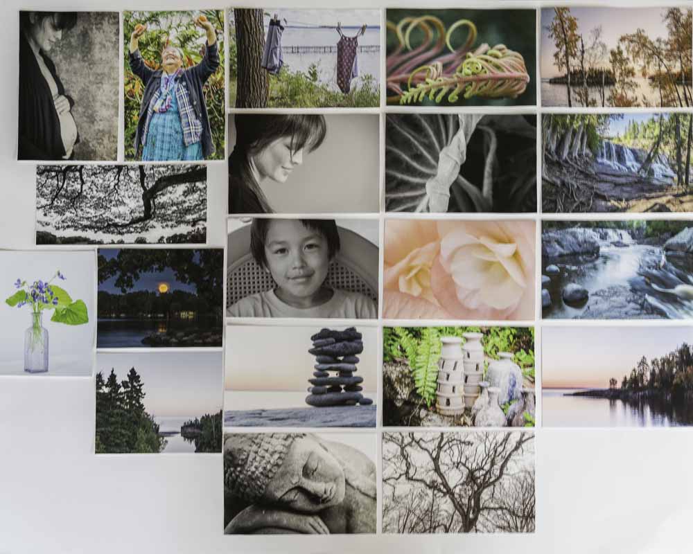
The photo above shows a poster I created with small prints of my 20 favorite photos.
I’ve been living with this poster for at least a week and noticing what stands out for me when I look at it.
The bare tree photo in the lower right captures my attention every time I look at the photos. It was one of my surprise picks. I had other tree photos that I thought I liked better but when I was going through my photos I kept coming back to this one. Something about the way the branches of the tree reach out in different directions, curving this way and that. I also like the somewhat high-key treatment of this photo. I like taking the exposure up as high as I can in photos like this without blowing out the whites and highlights. Photographer, Richard Avedon, is known for his high-key portraits with bright white backgrounds. While I find some of his portraits disturbing, I like the high-key look.
My current all-time favorite is the landscape in the upper right corner. I just love the delicate colors and the light in this one, along with the layer of leafy trees in the foreground and the island and point in the background. I love how everything comes together—color, light, and composition.
The people shots surprised me when I picked several of them as favorites. I’ve never felt like a skillful portrait photographer, yet I love these photos for the stories they tell and their beauty. The more I make portraits, the more I like this kind of photography. I don’t like event photography at all, but working with someone to make a portrait and capture the beauty I see captivates me.
I love the photo of swim suits hanging on the clothesline at the lake because of the story it tells about families enjoying time together at the lake. I can almost smell the campfire in the evening and the suntan lotion at the beach. Technically, it’s not one of my favorites but I love it’s story so much.
I love the yellow/orange uncurling fern because I love plants and I especially love seeing them when they first unfurl. The shapes, textures, and colors of this one are so beautiful. I love the taro leaf photo just below the bright unfurling fern because of it’s gorgeous shapes, curves, lines, light, and darkness—it feels so mysterious and elegant.
The monkey pod tree (second row left) I love for it’s amazing shape that echoes the shape of the ground below it. And I love it because I remember the immense size of the tree and how it spreads out all around, the guardian of a Japanese cemetery on the Big Island of Hawaii.
The pottery photo also reminds me of a place, an artist (the potter who made the pots) and the artist’s wonderful home/studio and traditional kiln. I love the texture on the pottery and the way the ferns grow up between and around them, creating a kind of still life.
The Sleeping Buddha photo is one that surprised me when it turned out so well. It’s all about the angle of the shot and the light. I made other photos of this statue from other points of view and including more of the statue. None of them pulled me in like this one that shows most of the head (but not all), a shoulder, and one hand. This is my all-time best seller in my Etsy shop and I never tire of looking at it or printing it for customers. I love the simplicity of the black and white in this photo; color would have distracted from the texture, shapes, light and shadows.
The soft pink/peachy begonia flower, I love for it’s color and softness along with the composition. I love flowers so it is not surprising that this one made it into my favorites. The wild violets in the tiny purple vase are simply beautiful. The use of three leaves, the tiny vase provides just the right amount of support for the arrangement without pulling attention away from the flowers. I also love the high-key treatment I gave the photo.
I love the rock cairn because I love the zen feel of them, but also because of the simplicity of this one against the lake and pre-sunrise sky. The gray of the rocks combines beautifully with the soft pink horizon sky.
The full moon shot was my first successful full moon photograph. I love the tree on the right that frames the moonrise, the rocks in the foreground, and the gold of the moon and deep blue of the night sky.
The other landscapes are all Northern Minnesota sights that I love as it is the place that I go to renew my soul. I love the waterfalls, forests, rocks, and Lake Superior scenes as it is one of my favorite places on earth.
When I look at all of the images together I see some common threads in my love of light, soft colors, high-key images, nature, and landscapes, but many differences as well.
What do you think? Is it beginning to look like a body of work? How can you create your own kind of Vision Practice for your art/work?
May you walk in beauty.


0 Comments