Quote of the week: “A photographer who wants to see, a photographer who wants to make fine images, must recognize the value of the familiar.” — Freeman Patterson
I’m still working with Doug Beasley‘s wonderful Vision Quest Cards: Photo Assignments For Personal & Spiritual Growth in my photography self-study assignments. This week I drew the card that says, “Photograph an object that is very important to you as if it were a sacred relic. Pay attention to lighting.
Hmmm… my first problem with this assignment was choosing an object that is very important to me. I’m not very attached to things so finding some thing that was important to me was very challenging. The most important object in my life is probably my camera, followed closely by my house. But since I need my camera to make the photograph and my house felt a bit big for the assignment, I chose a vase that I have kept from childhood.
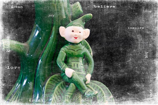
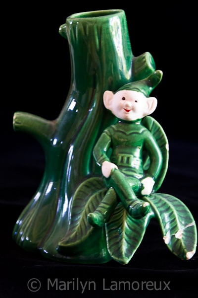
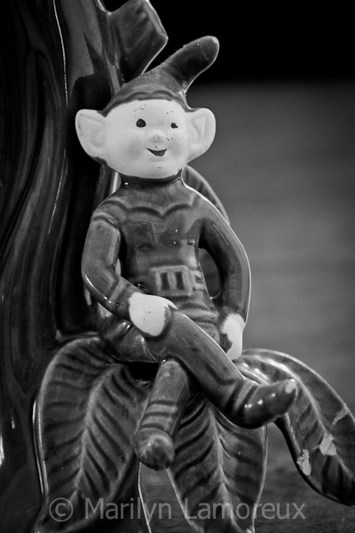
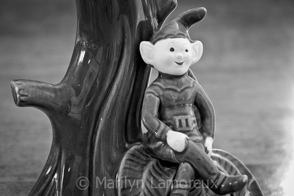
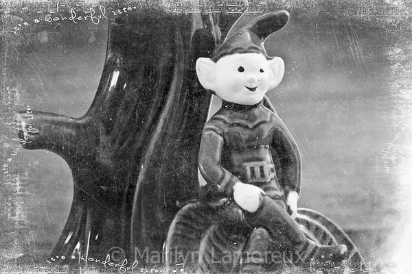
It’s a silly little green vase that looks like a tree trunk and has a little elf or brownie sitting on some leaves. I love the whimsical feel of this vase and I love the memories I have of picking flowers from my mother’s flower gardens and arranging them in it.
To make the photos I chose my favorite spot in the house, my dining room. It has windows to the south and the east but both are shaded in the afternoon. I tried a couple of shots and saw that I was getting a lot of glare from the south window, so closed the blinds on it. With my camera on a tripod, I was fine with the slower shutter speed from less light.
I decided to use a large piece of black velvet as a backdrop and underneath the vase and made several photos that way. Then I let the beauty of the maple table show while I still used the black velvet draped over a foam board leaning on a chair to block other background distractions.
These photos turned out to be my favorites. I also discovered that my favorite photos were ones where I deliberately did not include the entire vase in the photo or where I left a lot of negative space on one side. The centered in the middle full-vase photos were just not interesting.
I decided to play with adding some textures to some of the photos, enhancing the whimsical, fun feeling of the vase. Because the photos were so dark, I decided to try using Kim Klassen’s black “magic” textures which, when blended in screen mode introduce lightness. I liked how they turned out.


0 Comments